When you look at a world map, you’re not just seeing geography—you’re seeing a perspective. Two of the most debated projections in cartography, the Mercator and Gall-Peters maps, offer radically different views of our planet. Let’s explore how they compare, and why Africa, in particular, has been misrepresented for centuries.

The Mercator Projection: Navigation’s Darling
Developed by Gerardus Mercator in 1569, this projection was designed for sailors. Its genius lies in preserving angles and direction, making it ideal for plotting straight-line courses across oceans. But there’s a catch: it distorts size, especially as you move away from the equator.
- Pros: Excellent for navigation; preserves shape locally.
- Cons: Grossly inflates landmasses near the poles—Greenland looks the size of Africa, which is wildly inaccurate.
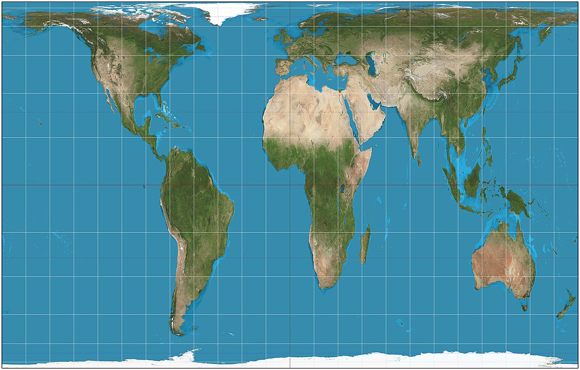
The Gall-Peters Projection: A Push for Equity
Introduced by James Gall in the 19th century and popularized by Arno Peters in the 1970s, this projection aims to correct the size bias. It preserves area, meaning countries are shown in proportion to their actual landmass.
- Pros: Accurate land area representation; highlights the true scale of developing nations.
- Cons: Shapes are distorted—countries appear stretched vertically near the equator and squashed near the poles.
Africa: The Most Distorted Continent
Few continents suffer as much visual misrepresentation as Africa on the Mercator projection. Due to the mathematical design of the projection, Africa appears much smaller than it is in reality. On Mercator maps, Europe and the United States often seem comparable in size or even larger than Africa, when in fact, Africa could fit the U.S., China, India, Japan, and much of Europe combined within its borders.
The Gall-Peters projection restores Africa’s true prominence. It reveals the continent’s actual size and rebalances our perception of its importance and scale. In doing so, it challenges long-standing visual biases that have historically underrepresented African nations and contributed to a Eurocentric worldview.
Why It Matters
Maps are more than geographic tools—they shape cultural narratives. The Mercator projection, while useful for navigation, reinforces outdated and inaccurate perceptions of the world’s power dynamics. The Gall-Peters projection, despite its own distortions, encourages viewers to reconsider those perspectives, especially when it comes to understanding Africa’s true scale, resources, and global significance.
So next time you glance at a world map, ask yourself: Whose world am I looking at?